3D typography is what I do most. Letters as objects, with real materials, lighting, and depth. All created on iPad in Nomad Sculpt. Here's how I approach it.
Three ways to build letterforms
There's no single right method. I switch between these depending on the piece.
Tube tool: Best for script and flowing lettering. Draw the path, adjust thickness and smoothing. The tube tool in Nomad Sculpt is surprisingly good for organic letter shapes. Most of my Instagram lettering pieces start here.
Primitive extrusion: Start with flat shapes, extrude to give them depth. Works better for geometric, blocky type. Less organic than the tube tool but more precise.
Import and sculpt: Create flat letterforms in Procreate or another 2D app, import as a reference, then build the 3D version in Nomad Sculpt. Useful when you have a specific typeface or hand-lettered design you want to make dimensional.
Getting the shapes right
Work on each letter separately first. Get the form, thickness, and proportion right before combining them into a word or composition.
Use symmetry where it applies. Letters like A, H, M, O, T, U, V, W, X, Y are symmetric. Build half, mirror it. Saves time and keeps things clean.
Voxel remesh after merging. When you combine letters or add elements, the mesh gets messy. Remesh to clean topology before adding surface detail.
Materials make the type
The same letters look completely different depending on the material. Chrome, clay, wood, glass, concrete. I often render the same composition with 3-4 different materials to see what works best.
The Smart Materials Pack has 64 options specifically for this kind of experimentation. Apply, compare, decide.
Lighting and composition
Flat lighting kills 3D type. You need directional light to create shadows between and within letters. An HDRI environment for reflections on metallic or glossy surfaces.
I usually position the type slightly below camera center, angled toward the viewer. This gives a natural perspective that makes the letters feel physical. Experiment with camera angle before you commit to final materials and lighting.
From Nomad Sculpt to final render
Nomad Sculpt's built-in renderer handles most of my work. AO for contact shadows, bloom for glow effects, depth of field to focus attention. Post-processing is subtle but it's the difference between "3D text" and "3D art."
For more complex scenes, I export GLB with materials and bring it into other tools. But honestly, 90% of what I post is rendered directly in Nomad Sculpt.
Learn the full workflow
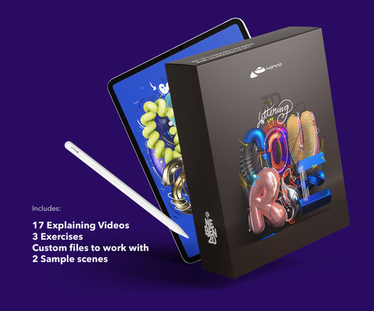
The Lettering Course walks through the complete process: building letters, applying materials, lighting, rendering. 7 modules, 132 minutes, all on iPad. The Techniques Course goes deeper on materials and visual experiments.
About the Creator
nebenzu is run by Ben, a Munich-based designer and 3D artist with a community of 128,000+ followers across Instagram, TikTok, Threads, YouTube, and X, focused on Nomad Sculpt workflows. The courses come from years of daily work in Nomad Sculpt, creating 3D typography, materials, and visual experiments.
You can find free tutorials and behind-the-scenes content on the nebenzu YouTube channel and Instagram.